Portfolio: Website Design
September 2020 (48 hours)
Shipped
HTML/CSS
Visual Design
UX/UI
INTRO
A few years ago, I had created a basic personal website for myself, but I wanted to challenge myself to use my design skills and a 48-hour timeframe to re-design my entire personal page and to also showcase my past work. This project's time constraint allowed me to be laser focused on what I wanted my design priorities to be. I hope you have enjoyed your experiences on the site so far :)
Redesigned Site
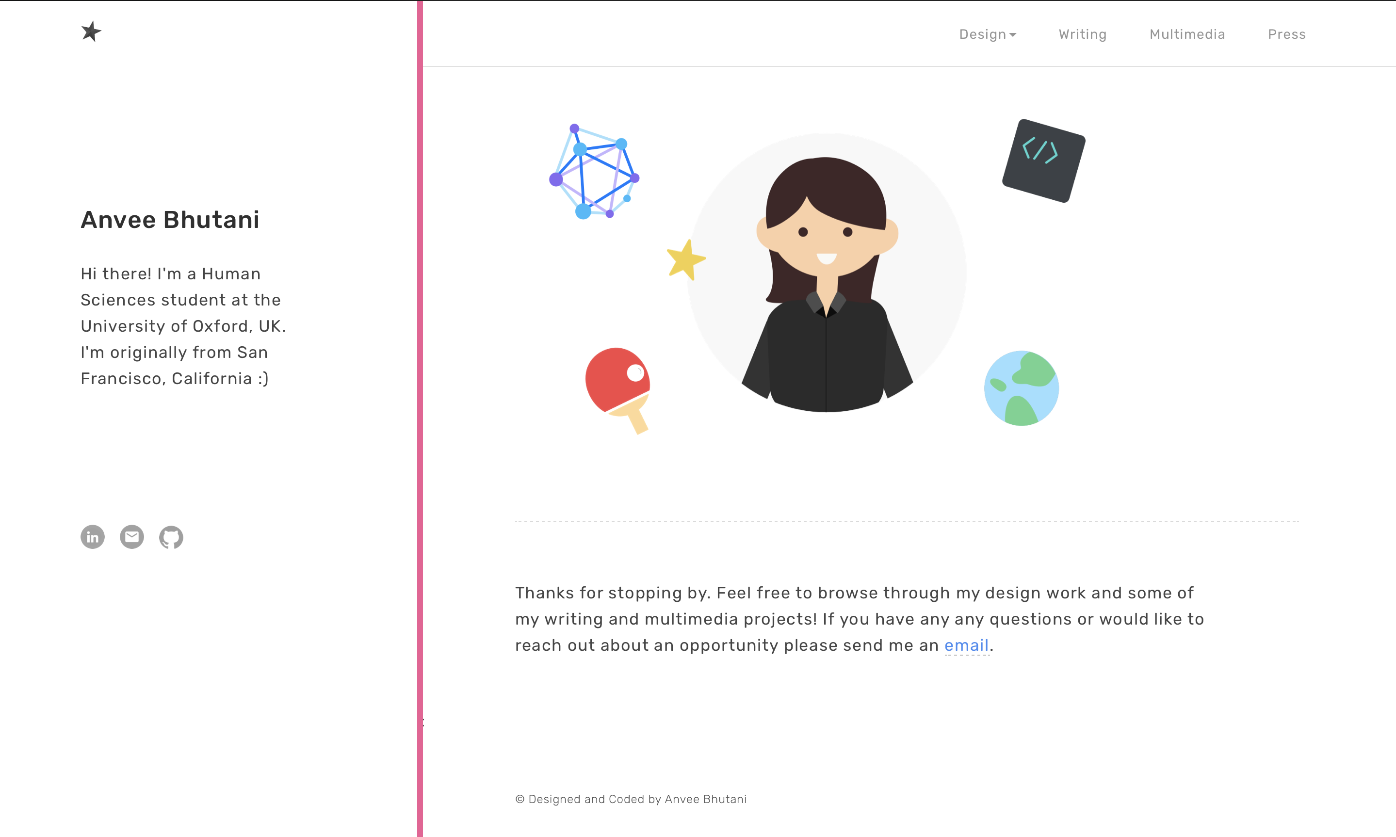
OVERVIEW
Use design to highlight my own work and projects
My current website is visually frustrating and not very user-friendly. From the carousel of text that appears on the homepage, to the dark theme and large first screen that appears on each tab, it is difficult to navigate through the various sections and is neither memorable nor eye-catching. Having now gained a lot of designed experience, I wanted to put myself to the test and see what I might be able to come up with. I also wanted to use the project to find my personal design style as this was not done for any client or other company.
DEFINING GOALS
I firstly defined the two main goals of the site:
1. Provide value. Display projects and content that is visually appealing and informative for any website visitors to take away something from a quick browse.
2. Show my personality. Use my own creativity and visual guide to bring unique style elements and features.
2. Gain Opportunities. Use my site as a way for future employers and clients to better understand my work and award me with opportunities
USER INTERVIEWS
Categorizing the pain points
Before jumping into the design process myself, I wanted to talk with some people who would be likely to visit my website to understand their perspective. I spoke with 4 individuals -- 2 university acquaintances, 1 PM at a local software startup, and a recruiter who has worked in hiring various positions. Here are some my findings:
1. Lack of visuals. The website currently lacks images and graphics to break up the text which makes it visually unappealing.
2. Text is difficult to follow. The background colors on the website combined with the centered text and thin black font have made it so that it is easy to lose your spot while reading or get distracted.
3. Information is not accesible. The homepage and all the subsequent pages have a large header which takes up the entirety of the page and only once the user scrolls down are they able to view any details.
4. No Brand Identity. The website as a whole doesn't have a clearly memorable style or intriguing visual display. There is also no personal identity present which makes it more difficult to resonate with the material.
DESIGN DECISIONS
Direct user attention to what's important
Below are some major design decisions I made to direct users' attention:
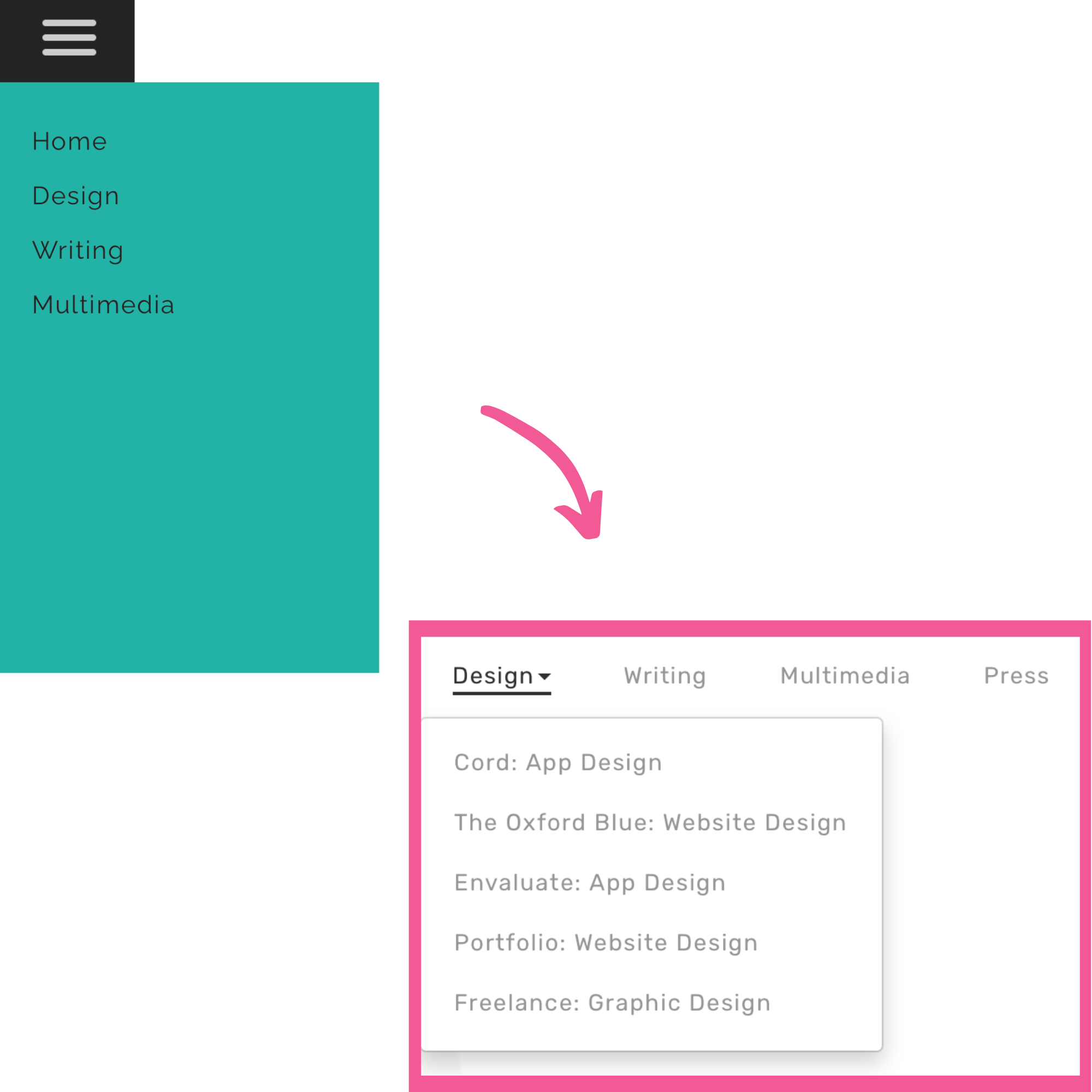
Make navigation bar visible
With the previous website version, I had a 3-line menu hidden away on the side. But my testing revealed that users would want to be able to see all the pages when they go onto the site. Furthermore, previously I had all the design projects linked to the the design page, but I decided to link them all to the navigation bar as well so that users could navigate to the projects directly from the homepage without having to click through more pages, a process that complicated the user flow.
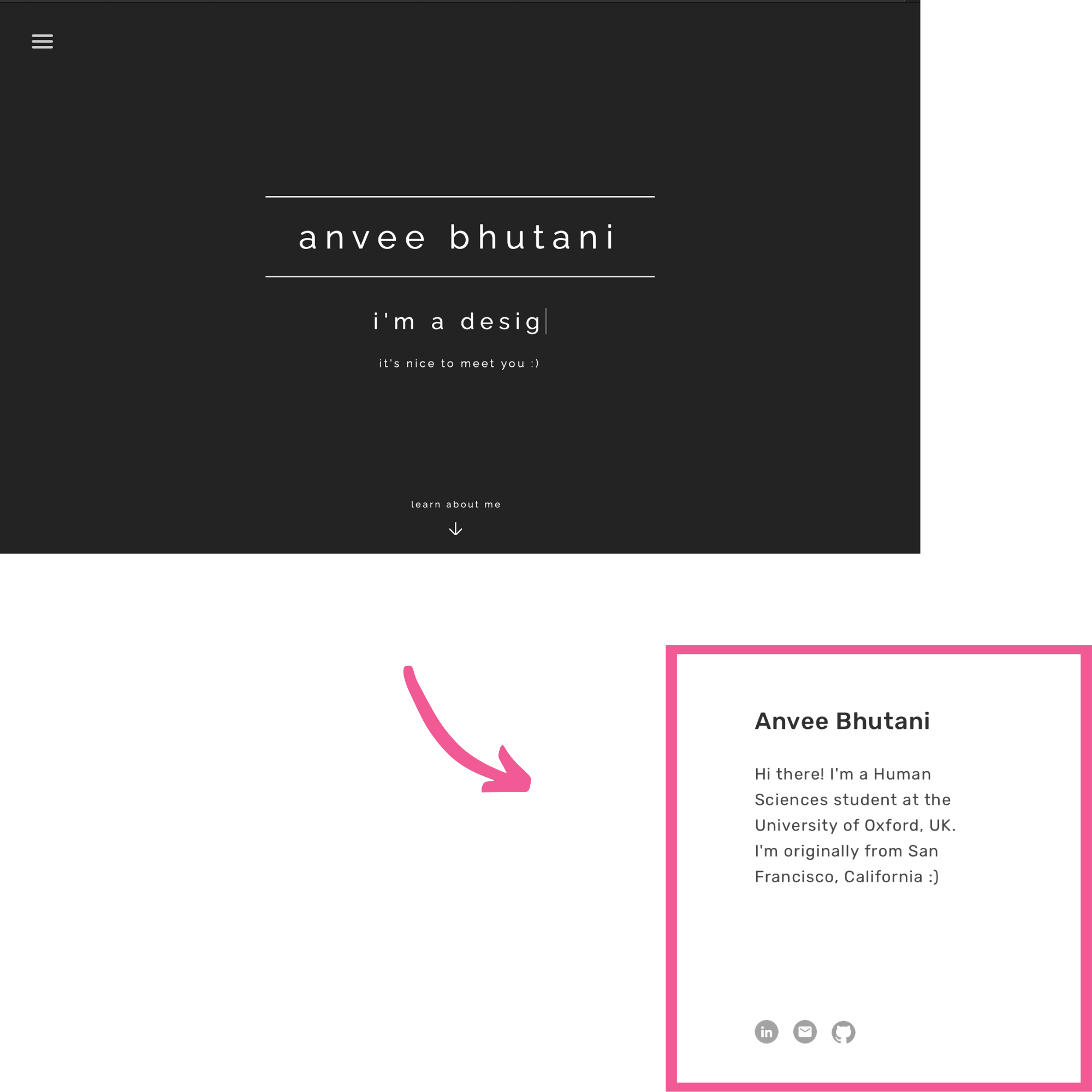
Make header smaller
The former header had a large title and a huge carousel text on each of the pages, but all the users I talked to felt that this did not add any value and I agreed that it took up valuable real estate. So, I decided on the homepage to replace this with some images and on each of the different project pages I just made the header smaller and in a contrasting color to differentiate it but still give the page a cohesive look.
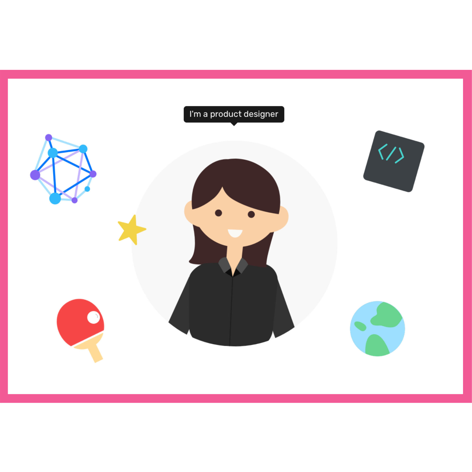
Add interactive graphic
One of my biggest goals with the page was to showcase some of my personality on my page and make it visually appealing, and I felt that the best way to combine these would be to have some images that bring color and also showcase more about me beyond just my work. I added the hover element to allow for a more interactive user experience.
BRAND IDENTITY
A cohesive visual system
For a site serving as a portfolio the visual style also needs to appear clean, engaging and user-friendly .
I paired a bright pink color with a simple sans serif font to make the website appear simple and easy to follow. The sans serif font is very readable and the pink helped clearly differentiate between the differnet sections.
REFLECTIONS
1. You are your greatest reviewer: Since this project was done entirely independently and without requirements and guidelines from a company or client, it gave me the creative freedom to take the designs in whichever way I wanted. At the same time, I knew that I didn't have anyone else to critique my work so I had to proactively think about what some possibe design issues could be and how to fix them.
2. Simplicity is key: With my old website, I had wanted to showcase cool features such as text that types out on screen and rotates through different phrases of text. But from all the feedback I got, I came to realize that the simplest designs usually make for the most user-friendly ones.