The Oxford Blue
June - August 2020
Shipped
Branding
Visual Design
UX/UI
INTRO
I redesigned the website for The Oxford Blue, the University of Oxford's student newspaper publication. Check out the live Oxford Blue website.
Original Site vs. Redesigned Site
OVERVIEW
Use design to showcase the The Blue's content, engage students, and build credibility
The current website for The Oxford Blue is difficult to navigate and not well organized. With all articles mostly on the homepage instead of being placed in categories, it is difficult to find even recent content without searching for it. Moreover, the website lacks a header and other information that is traditionally present in news publications. My role as Business Manager of the publication was using my design skills to redesign the site to appeal to students and potential sponsors.
DEFINING GOALS
With the rest of the business team, I defined two main goals of the site:
1. Provide value. Show content that is relevant, informative, current, educational, and helps the reader stay informed about everything happening around the University and greater community.
2. Attract Sponsors. Give potential investors or partners a good initial impression of the publication to entice them to financially back the student newspaper.
EVALUATE CURRENT WEBSITE
Brainstorming to understand user pain points
In order to start visualising the new website, I wanted to get a better idea of the content that would be organized on The Oxford Blue’s website. I conducted my own analysis alongside interviewing 15 different individuals. This included writers and editors across sections, general students, and business owners and public in the Oxford community. I wanted to gauge general impressions as well as better understand the behind-the-scenes of how content is published so I could turn this into a feasible design layout. Here are some my findings:
1. Inconsistency. At the moment, not every section is used equally or has content produced on a consistent basis. This means that we need to be able to accommodate sections that publish on a more irregular basis or combine sections.
2. Lack of Categorization. The homepage does not have a clear categorization of articles, but rather, is an endless feed of articles across sections.
3. No Brand Identity. The homepage does not clearly define what The Oxford Blue is nor does it link to any of the publication’s social media or other resources.


DESIGN DECISIONS
Direct user attention to what's important
Below are some major design decisions I made to direct users' attention:
Better organize header
Through interviewing Univeristy students, it became readily apparent that students were not reading much of the content because when the website first loaded, the banner took up most of the real estate and there was only half of the first article visible on the screen. To better utilize the space, I decreased the size of the banner so that without scrolling, users already view the top few breaking news articles.

Optimize list of articles
The "recent" list on the right side of the former website was disorganized and did not provide value to most of the people we interviewed as they had never used that to discover articles. To provide a better functionality, we organized the recent articles into their appropriate categories and at the bottom included a list of top articles based on reader statistics. There was also a list format of recent articles maintained but this was only for recent news.

Showcase standout components
In researching different University and professional publications, it became apparent that regular podcast and video content is a unique asset for the Blue and one that we wanted to highlight on the homepage. So, we created a column on the side for all of this content to be easily accesible and break beyond the traditional format of only displaying articles on the homepage.

BRAND IDENTITY
An easy-to-follow visual system that helps users discover content
For a site that provides people with the news, establishing a credible journalistic presence is crucial. At the same time, the visual style also needs to appear user-friendly and engaging .
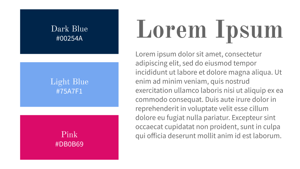
Regarding color choices, I chose the navy blue from the Blue logo along with a lighter blue and bright pink . The navy blue creates a professional identity as it has come to be associated with the University, yet the light blue compliments this by appearing brigher and more modern. The pink is an unconventional choice which gives the site a trendy tech feel and would appeal to younger users.
We picked Old Standard for the headers and larger text because it looks bold, historic and regal. It also matches the logo font well. The font for the main body text was Source Standard Pro because it is clean, friendly and easy to read.
REFLECTIONS
1. Diverse feedback is important: Throughout the process, I asked a lot of current writers and editors of the newspaper what their feedback was for the design. However, I soon realized that other students with no connection to the publication were sometimes able to provide better feedback because they did not use the website on a daily basis.
2. Prioritizing the goals equally: During the design process, I primarily spoke with students and consumers of the content in order to provide value to anyone consuming content on the website. However, I soon realised that it was equally important for me to consider the needs of sponsors since this is what the business team of the newspaper were looking to attract. This meant I had to speak with owners of small businesses and those who worked at larger corporations as well as ensure that the homepage had all information that a potential sponsor might be looking for.